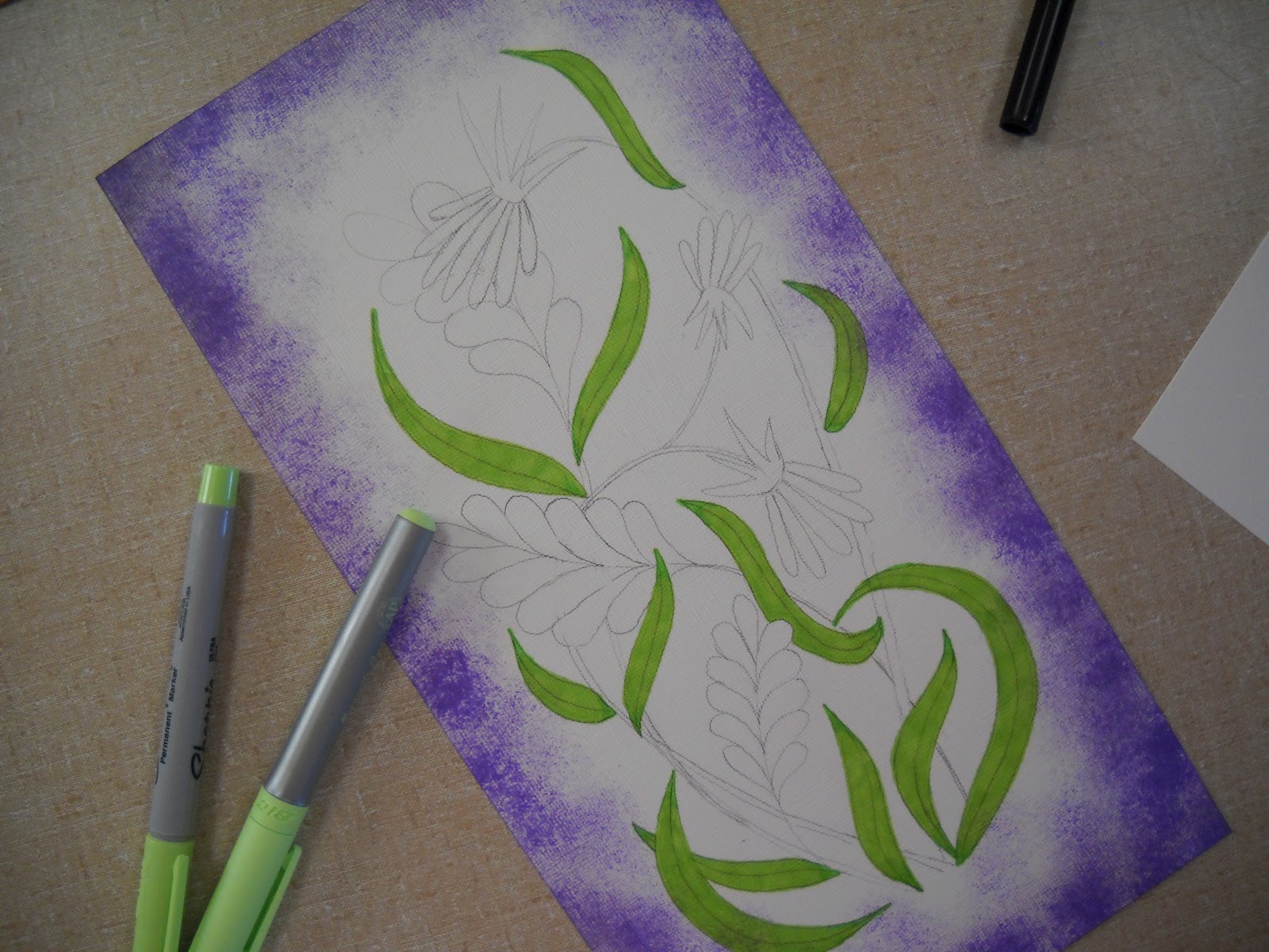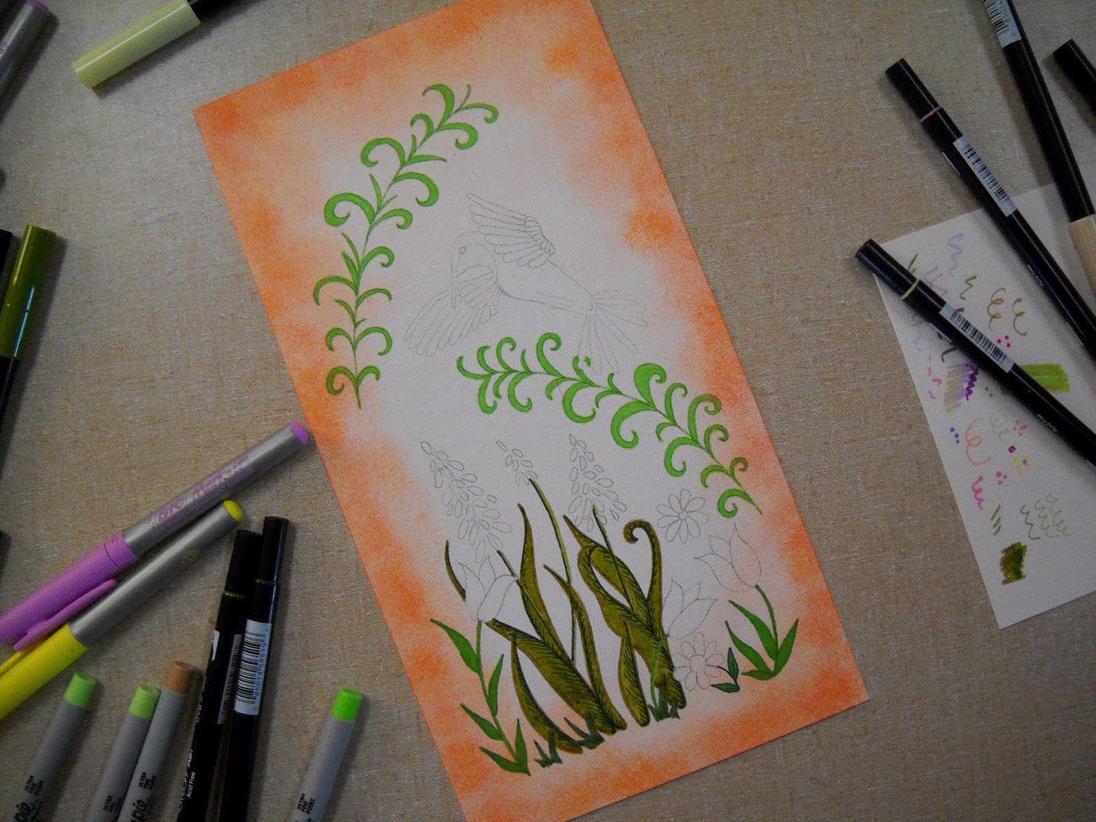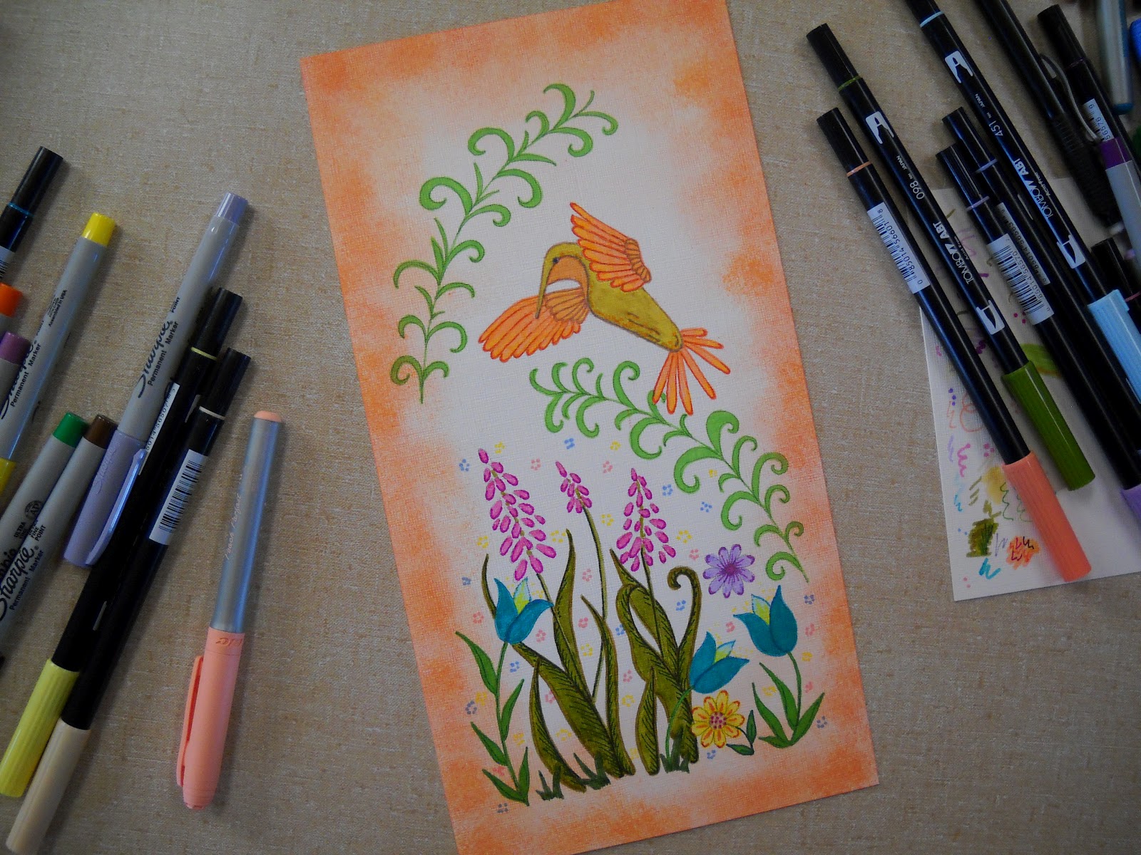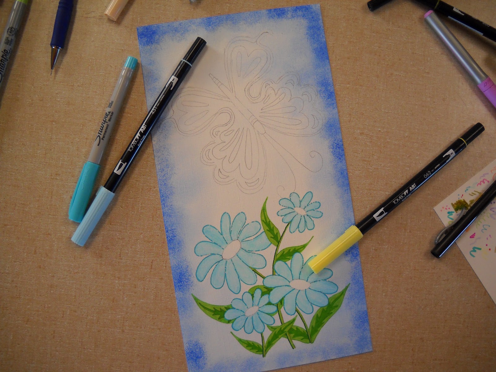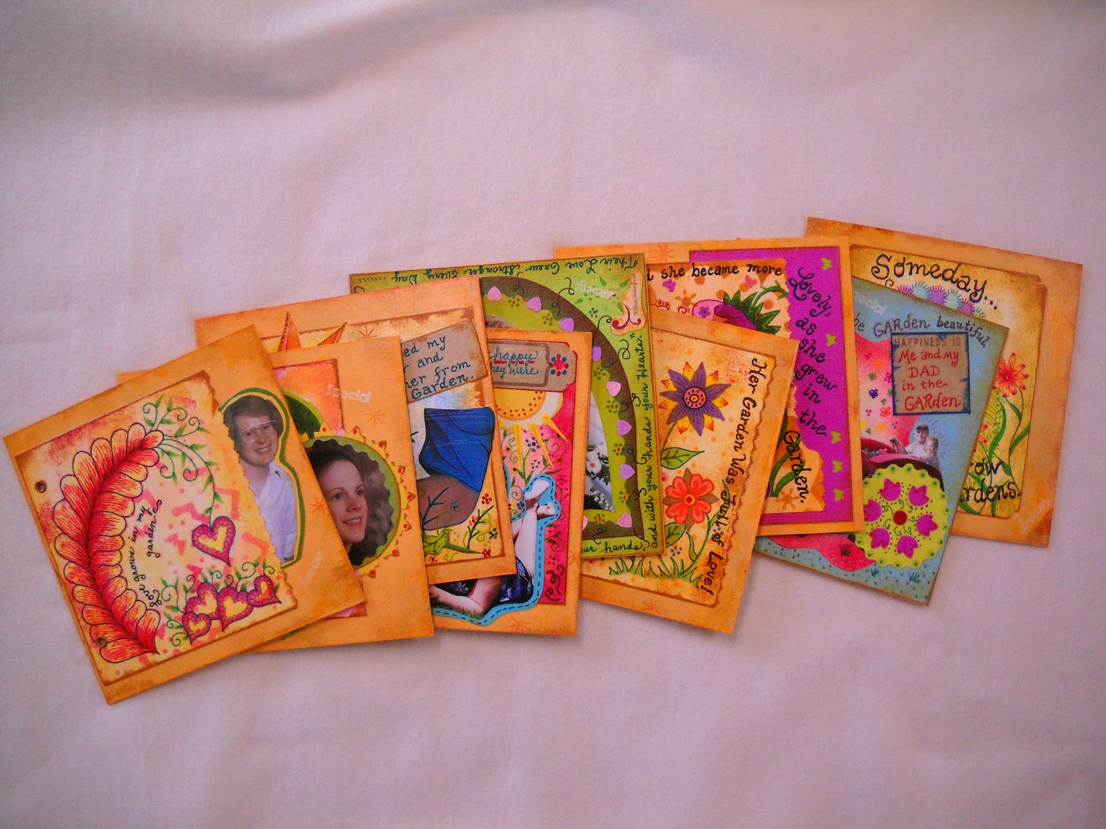

I recently had the urge to do a photo
keepsake book, but I wanted to push the envelope as to the design of the
project. I had asked my husband if I could use some of the old mat board that
he had left over from some of his past framing projects. The thickness and pure
white back was just what I was looking for. I wanted this project to be very
personal for me and for my daughter, who will get the book when I am done. As
the story develops, my life and hers progress through the different stages.
The
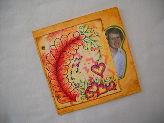
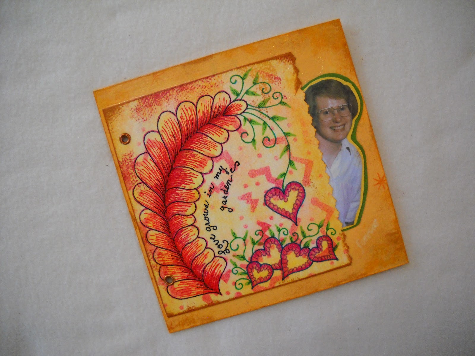
front page of this keepsake book starts with me at the age of 19.

After
the initial inking of my paper, I cut out snowflake patterns and then inked
over them to create the original background to some of the pages.
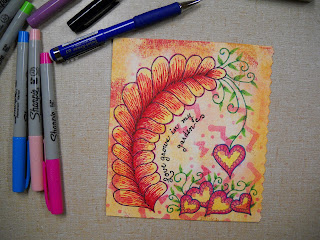

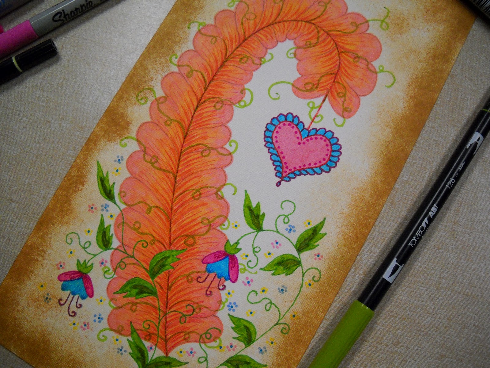
I
then free hand drew my page design, and used Sharpie and Bic pens to add color
to the page.

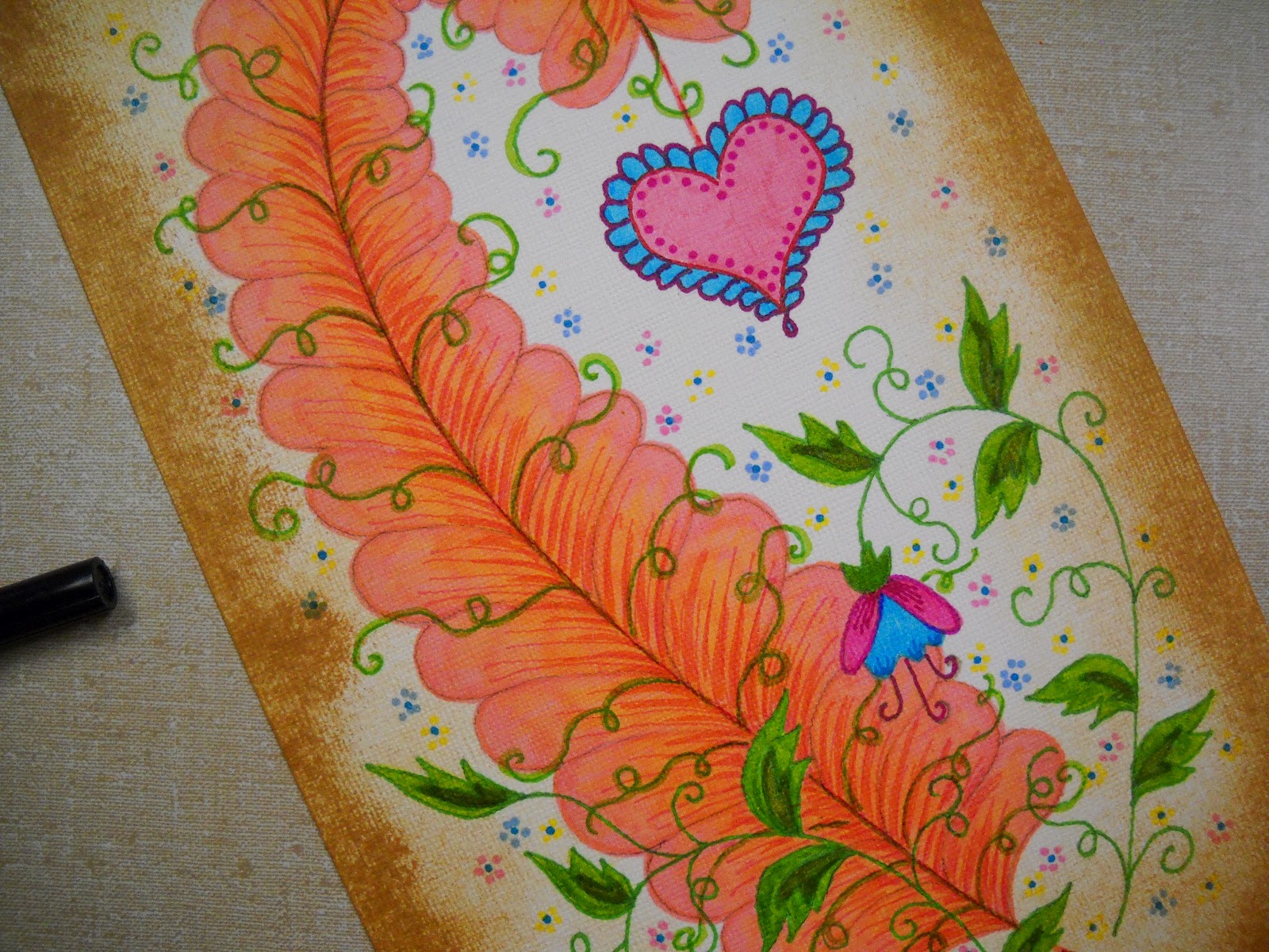
In
this picture I used my original page design and placed my photo peeking out the
right side. I really liked this design for the cover of my book. I had used the
mat board for the base of each page and painted it with acrylic paint and added
some text with stamps. I also did a lot of inking around the edges of each page
to give it an aged look.

It
took me a while to decide how I would connect all the pages when I was done. I
finally decided to use a punch and metal eyelets.

The
story will begin with my daughter Barbara, as a baby.

I
decided that not every page would have my art work on it. I wanted to
incorporate paper cutting, so I used scissors with pattern blades to cut out my
shapes. I then added a picture of Barb as a baby.

I
added more inking to the edges as the page came together. I didn’t have an
exact idea for the entire project at this time. The flower designs were just
what popped into my head to keep to the theme of the garden book.

The
page was then placed on the finished mat board.

This
page features Barb at the age of about 18, the day she wanted to leave the
house and start her own life.
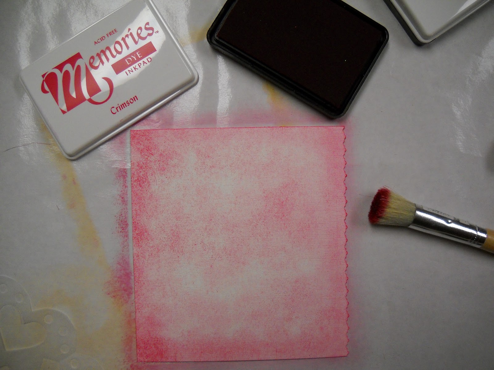
I have found
that the Memories Inkpads work very well for a lot of my projects. The ink is
permanent, so it does not smear or run when I coat the pages with adhesives and
sprays.
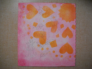

I
once again used a hand cut snowflake as a pattern to ink the hearts over the
start of this page. I then drew in my picture over the base layers of ink.

When
coloring this page I wanted it to look feminine
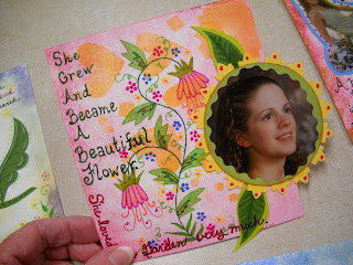
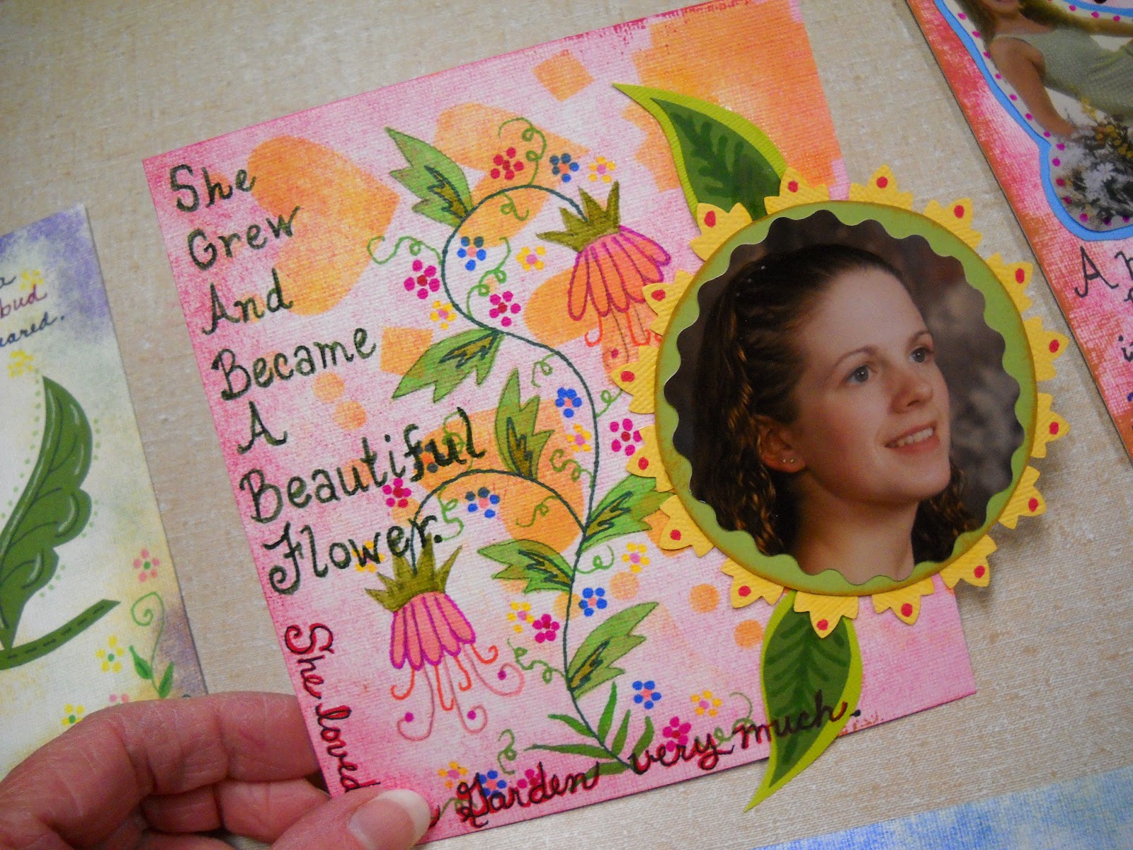
I
had never intended to have this book follow a standard layout. Here I have put
Barb’s photo well outside the edge of the paper.
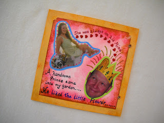

In
every story there has to be a handsome prince and true love, and that is what
this page was to represent. James captured Barb’s heart and swept her off her
feet.

Since
the main idea for this page was young love, I knew I want to include hearts, so
red had to be the starting color as well.

I
positioned the photos to appear that the prince was thinking of Barb. I backed
the photos with cardstock and added little confetti hearts.

I then added text to tell the story of the
prince.
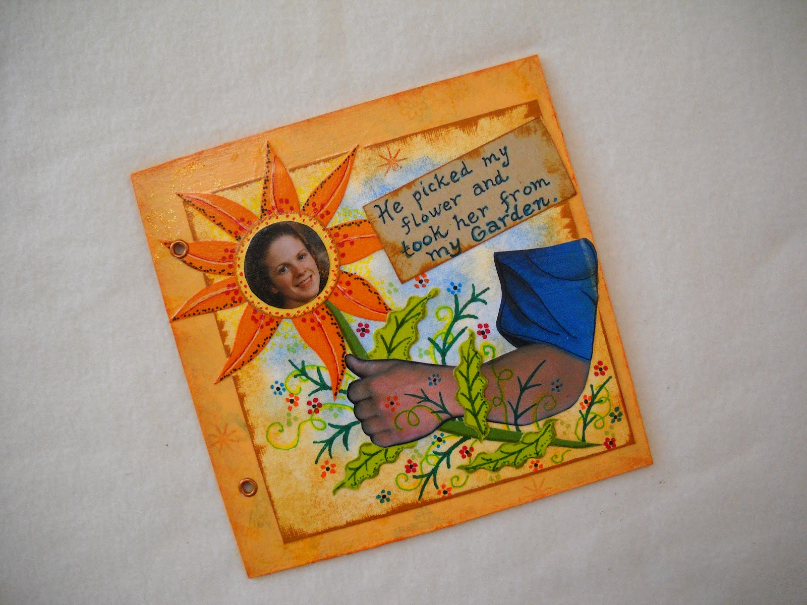
This
was probably one of the hardest pages to assemble. I knew I wanted a photo of
his arm coming into the picture to pick the flower. It took a lot of searching
to locate the proper photo of my son-in-laws arm in the proper position. I then
had it enlarged to fit the page.

You
can see in this photo all the different over layers of cut paper I added,
before it has been glued down.

Once
the glue was dry I used my markers to draw in the veins of the leaves and
flower details. I decided to put the text for this page on a tag I made from
cardstock and inked the edges.

You
can see in this photo how the metal eyelet looks when in place. It was
important to me to make sure that this book was sturdy enough to last through
the years.
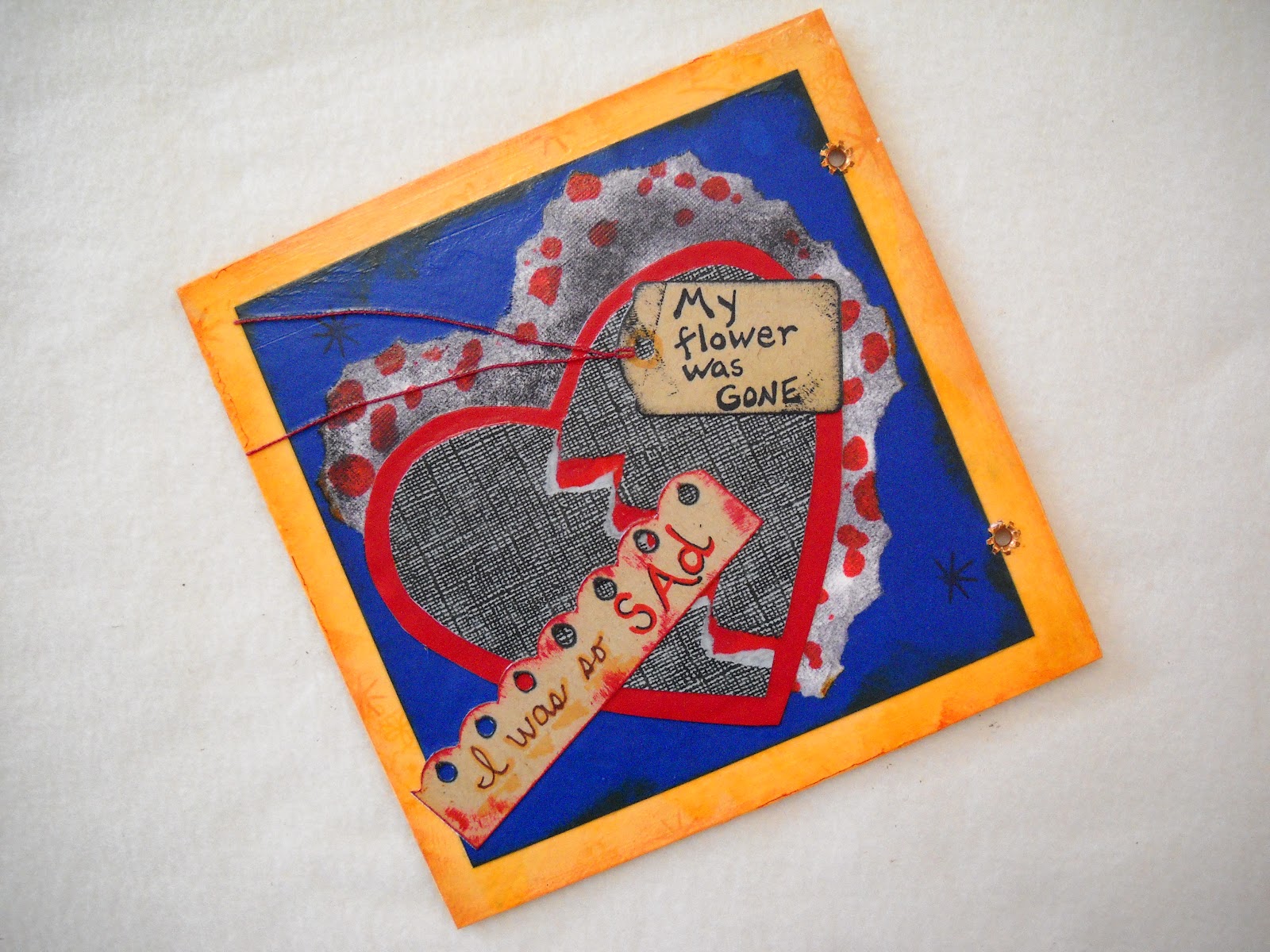
Each
story needs a little drama. This is how I felt then my flower was picked from
my garden.
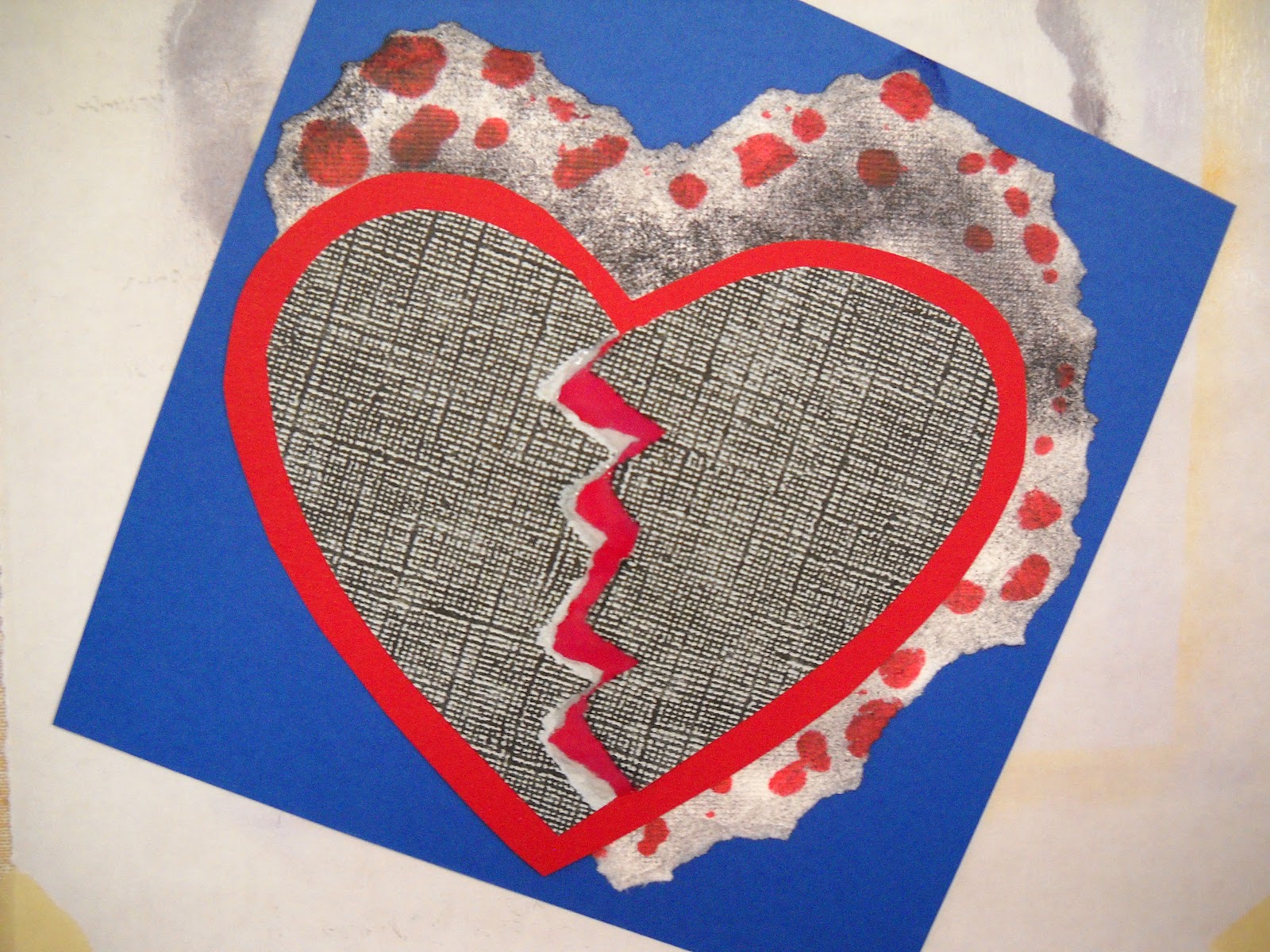
I
decided on using the core paper and tearing the background piece and then
adding ink in dark red. I didn’t want this page to appear happy.
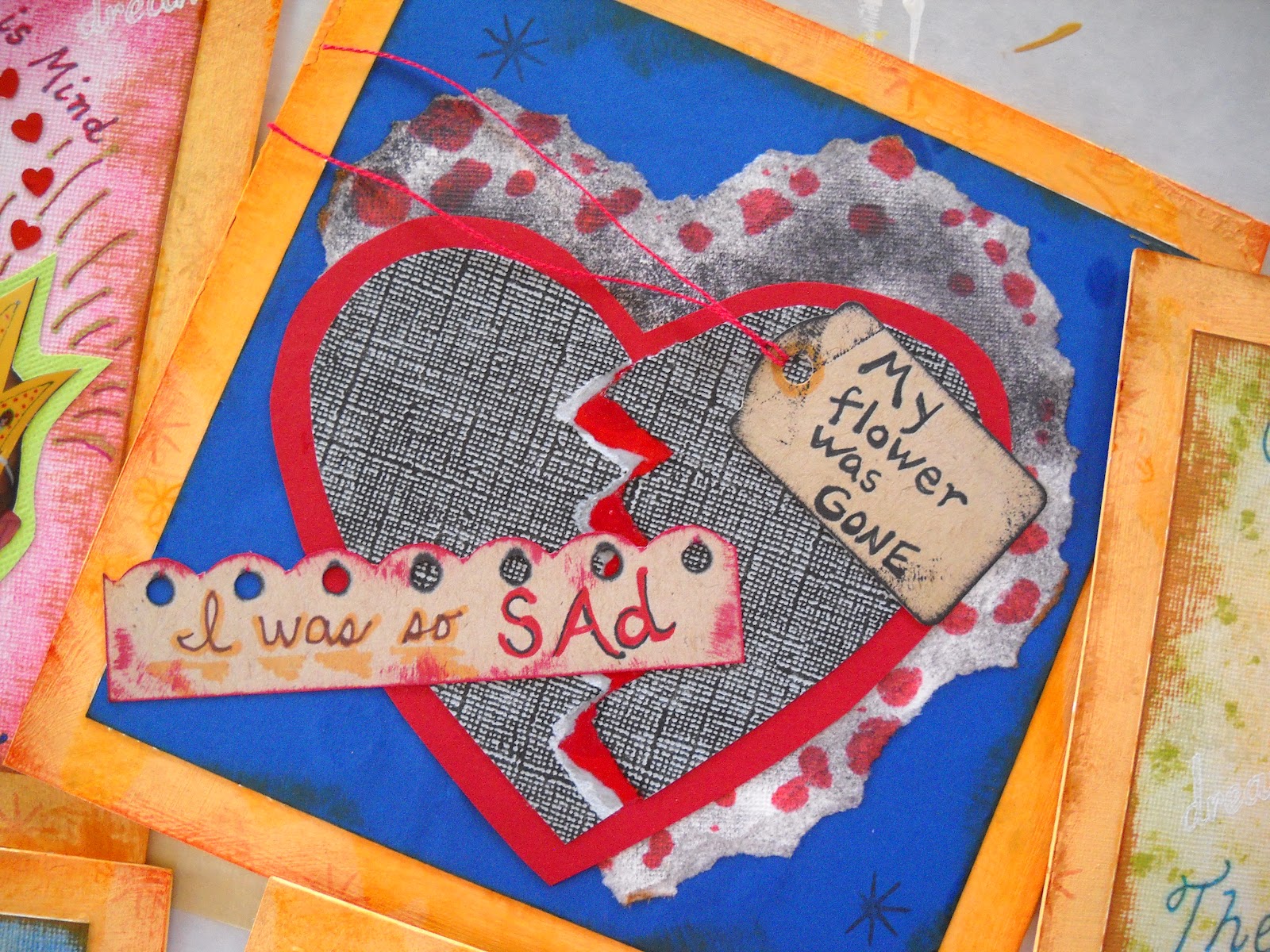
I
cut the heart from red paper and used another core paper for the top gray heart
and tore it in half. I really wanted to give the feeling of having a broken
heart. I then wrote my words on tags and inked the edges and added some red
pearl cotton to the tag.
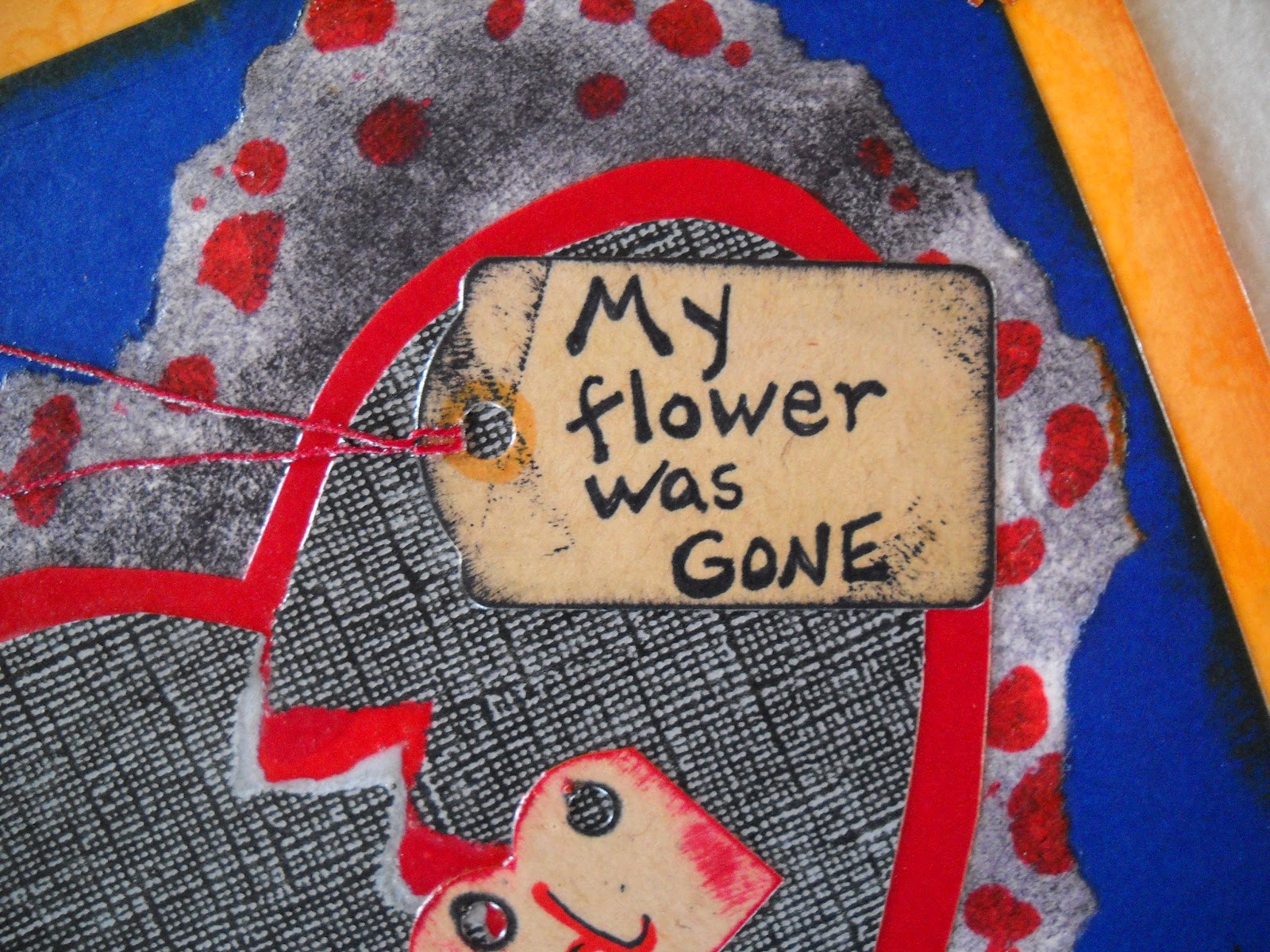
In
each step of this project, attention was given to every detail. I liked the way
the book went from being cheerful on the previous pages to appearing sad here.

Young
people starting their lives together is something that is so sweet, every day
the sun shines in their world, and that is what I wanted to show on this page.

I
wanted to put a sun into this page, so I began the page in this way. When I
thought it looked to plain, I had to rethink my approach.

Here
I colored in the background with flowers and then laid the photo over that.


Then
I added the sun and some rays around it. I let some of my papers overlap the
edge of my base paper to give the page some depth.
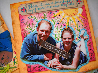
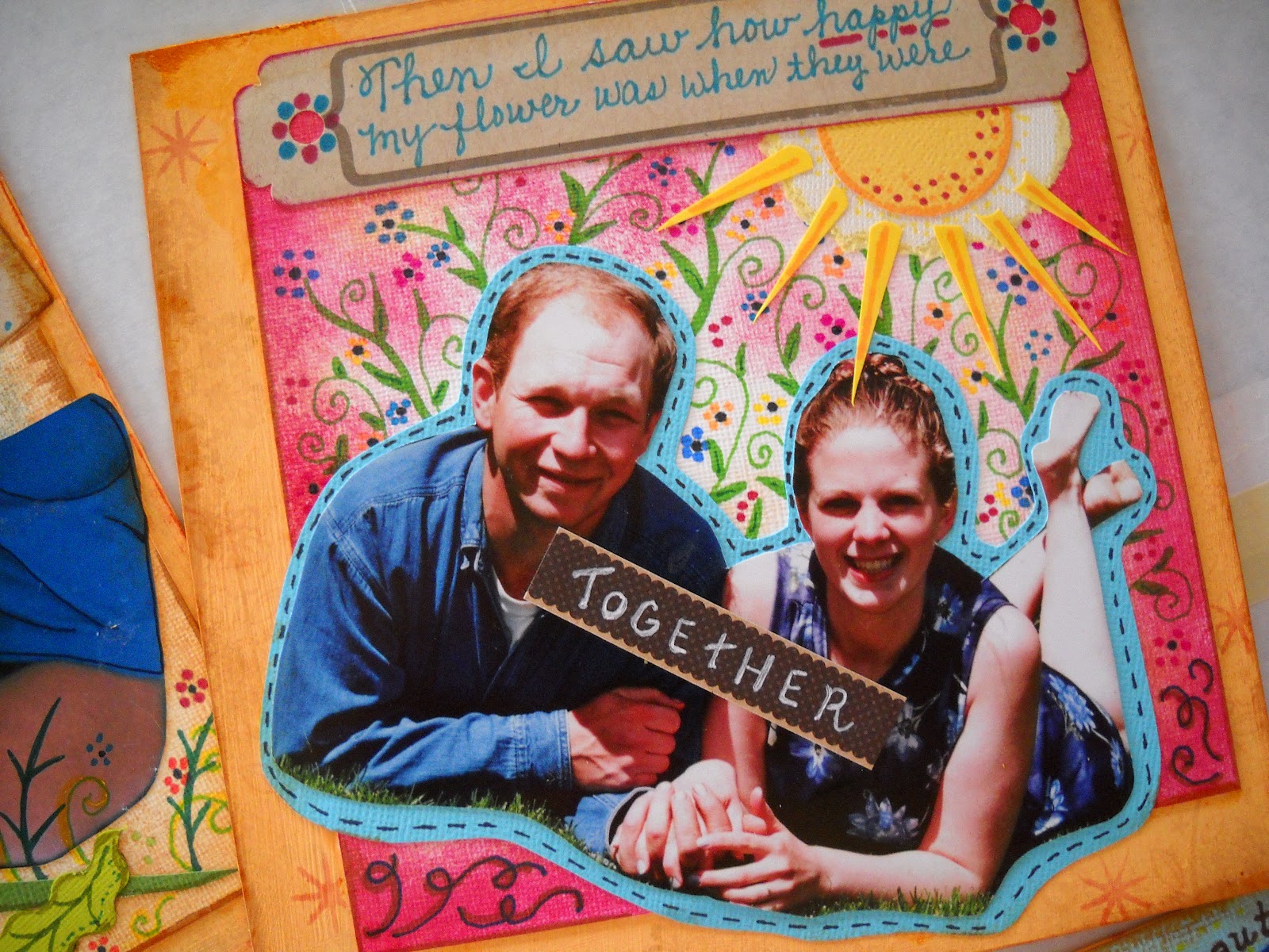
I
really liked the way this page came together.


I
did not want every page to have a multi-layered look and in this one the theme
was just a simple image in the center of the page.

I kept
the message I wanted to express on this page sincere. I used the same blue ink
to add text and color the ribbon around the bouquet.

After gluing down my paper to the painted mat
board, I sprayed the page with a matte acrylic spray.


This
one came together very nicely. It is simple and sweet.

The
big day had finally arrived.


Barb’s
favorite color is green, so I took a wedding photo of her and James together
and cut the background out of the picture. I then layered it on two colors of
green cardstock in the shape of hearts.

I had some pink metallic confetti hearts, so I
glued them down around the hearts. I then added flowers and inked the outside
heart with a darker ink.
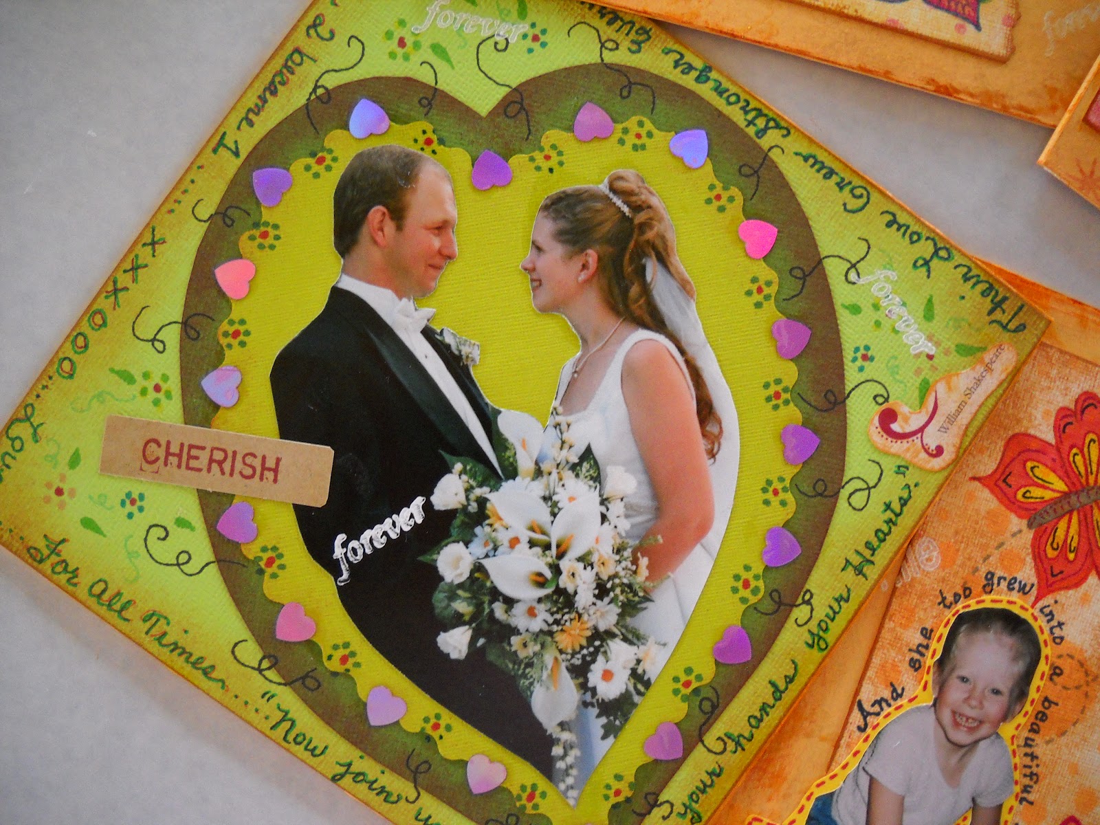
Here
I added little phrases around the outside edge of the page.

These
pages are in the drying process after the spraying of each page.

When
this little one entered our lives she brought us all so much joy. My first
grandchild! My daughter had so many changes in her life and now there was this
tiny creature that captured all our hearts.

I
cut Julie’s head out of a photo and added her picture to a yellow circle of
cardstock that I cut with a scalloped edge scissors. The inking process I used
here gives the paper a sprayed appearance with more control and less mess.

I
started with a white paper and dabbed yellow ink around the outside leaving the
center white. I then dropped ink right out of the bottle around the outside.

I
cut flower petals and arranged them around the circle. I then added a stem and
leaves. It looked very plain to me, so I got out the markers again and added my
words and details to the flower, leaves and stem.

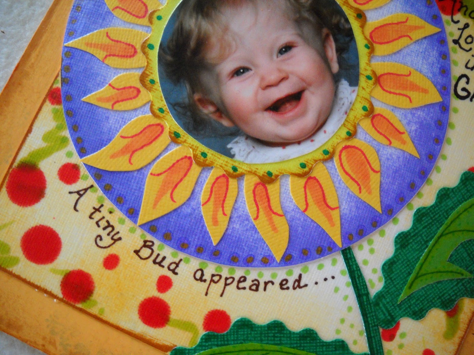
The
extra doodling, adds more visual interest to this page.

On
this page I wanted to show our little girl playing in the garden.

I
started with the same process of inking the paper and using a stencil I cut out
of paper to ink over the page again to create an unusual background. I then
drew my flowers in pencil as a guide to follow.

I
think I got a little carried away with the flowers.
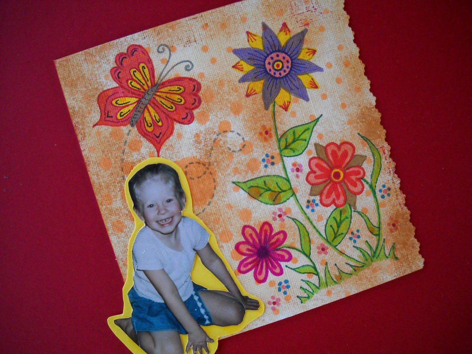
I
added her picture and applied it to cardstock in a bright yellow.
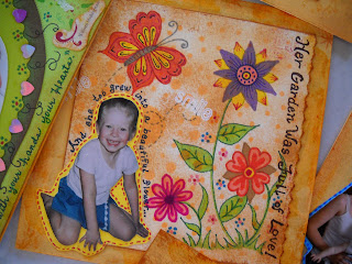

I
didn’t want my words to just be straight across the page, so I wrote around the
outline of her photo. With this page done, I glued it down to the treated mat
board.

All
parents have been asked the question, “Where do babies come from?” A good response was, “From the cabbage patch
dear.” Well, that is where the theme for this page came from. The picture of
the cabbage came from my oldest granddaughter. She grew it from a seed and was
so proud of her achievement that they took a picture of it.
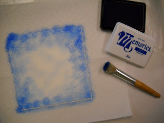

The
colors I was using in this page are going to be very light, so I needed to keep
the inking colors to a minimum.

It
took a little bit to get the size of the cabbage to the right size of my
picture of Emma. I had no choice, but to let it overlap the side of the page.
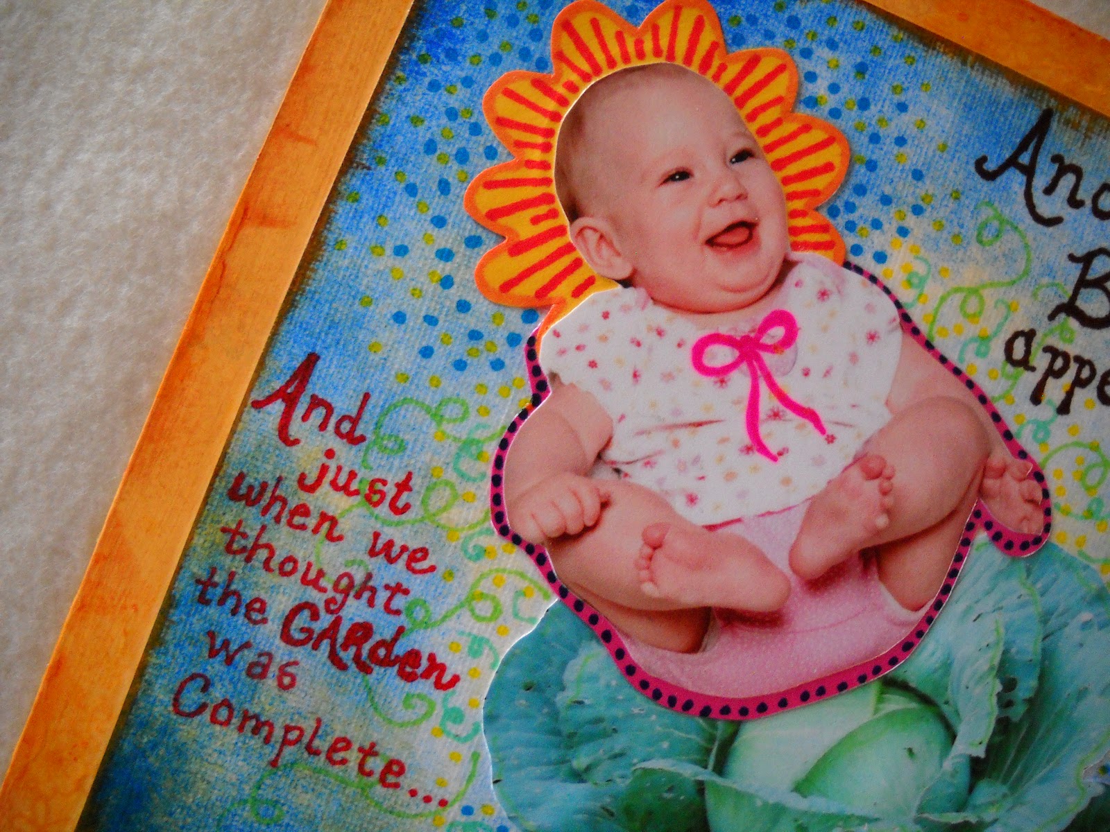
Now
we had two special granddaughters to love.


This page really plays along with the garden idea.

As I stenciled these pages, each one was designed to be
totally different from the other.

I had a lot of fun with this flower – totally from my
imagination.

I used quite a variety of techniques on this page. I started with the stenciling, and then my
drawing. I added paper cutouts, her photo, and then I put in a few paper punched
butterflies.

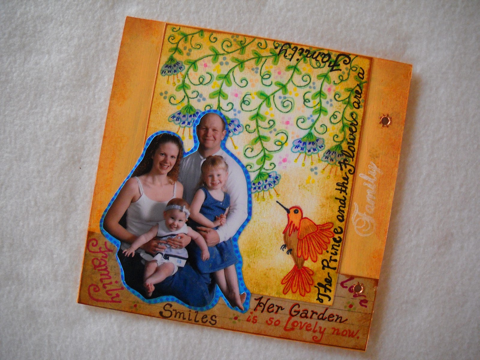
Well,
the family is complete – for now – and her garden is all planted.

I
wanted to come up with a different approach for this page, so I drew in flowers
and vines dropping down from the top of the paper.

I love to use
the different green pens and markers. They are my favorite color to work with
at this time and they blend together so easily.
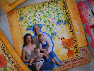

This
piece really took on a dimensional look by the time I finished it.
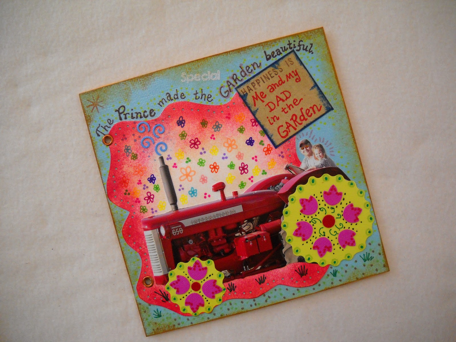
My
son-in-law will have a fit when he sees what I have done to his restored 650
International Tractor. Good thing he has a sense of humor.

You
can see here that not every page started out square. I punched small holes
around the outside with a hole punch.

I
cut out the wheels in the original photo and I first went with the idea of black
paper torn in a circular shape. My husband walked by and suggested a more
colorful approach. I came up with the
idea of making the wheels very bright and added cut flowers around the inside.
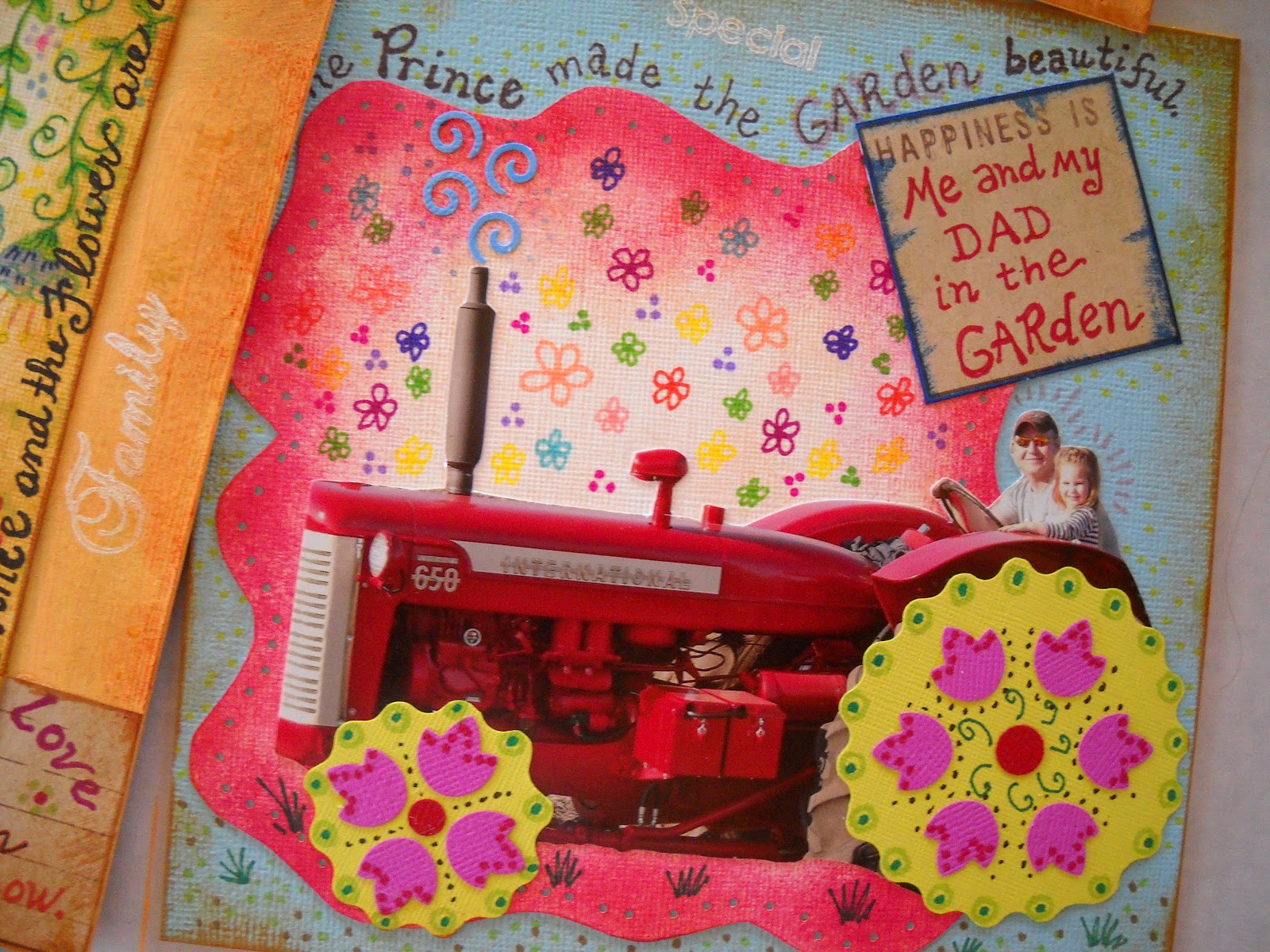
The
pinks and reds really came together in the completion of this page.

You
can see the attention to detail. Even the exhaust on the tractor had thought
given to it.

I
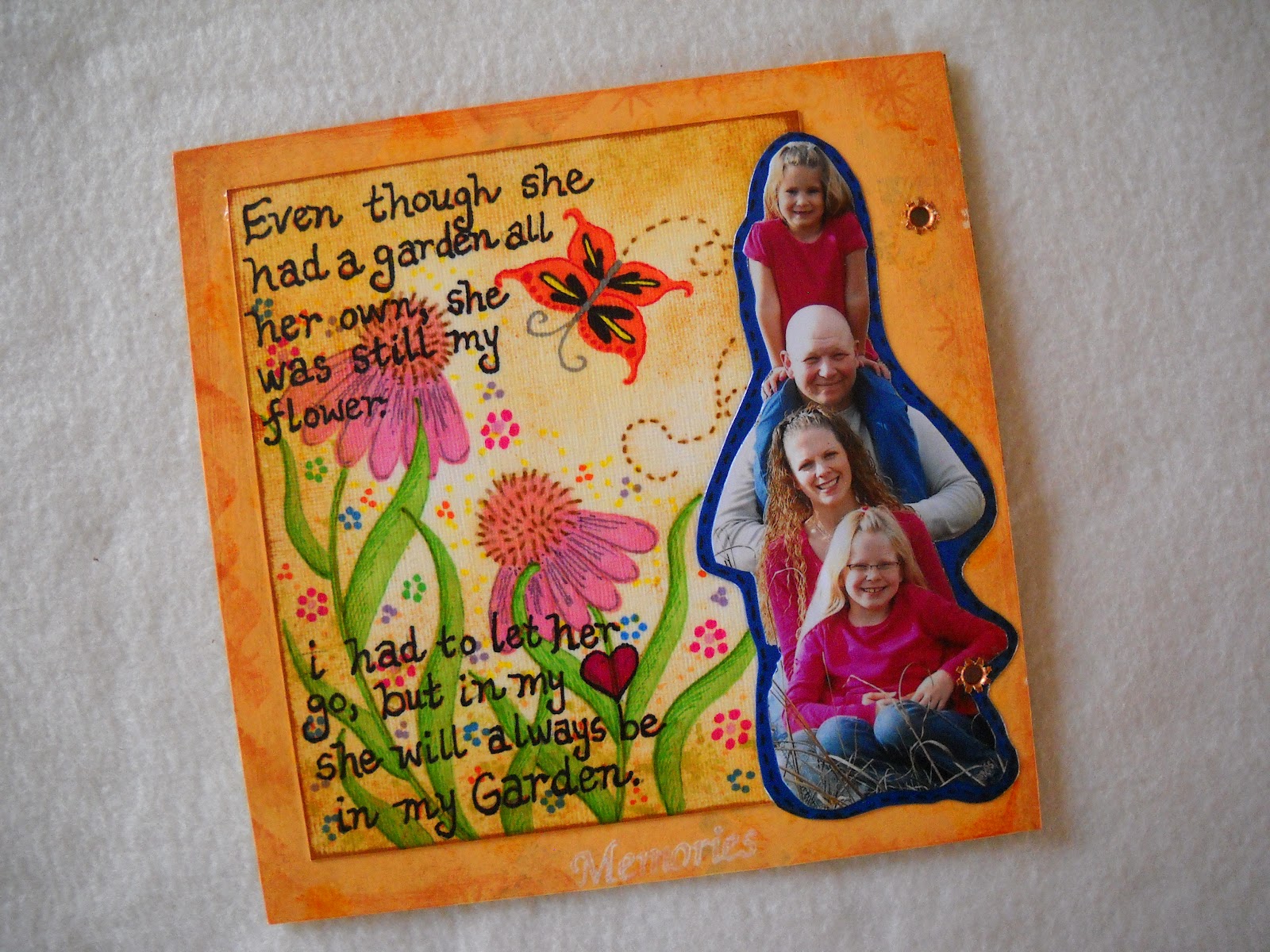
am getting close to the end of my project.

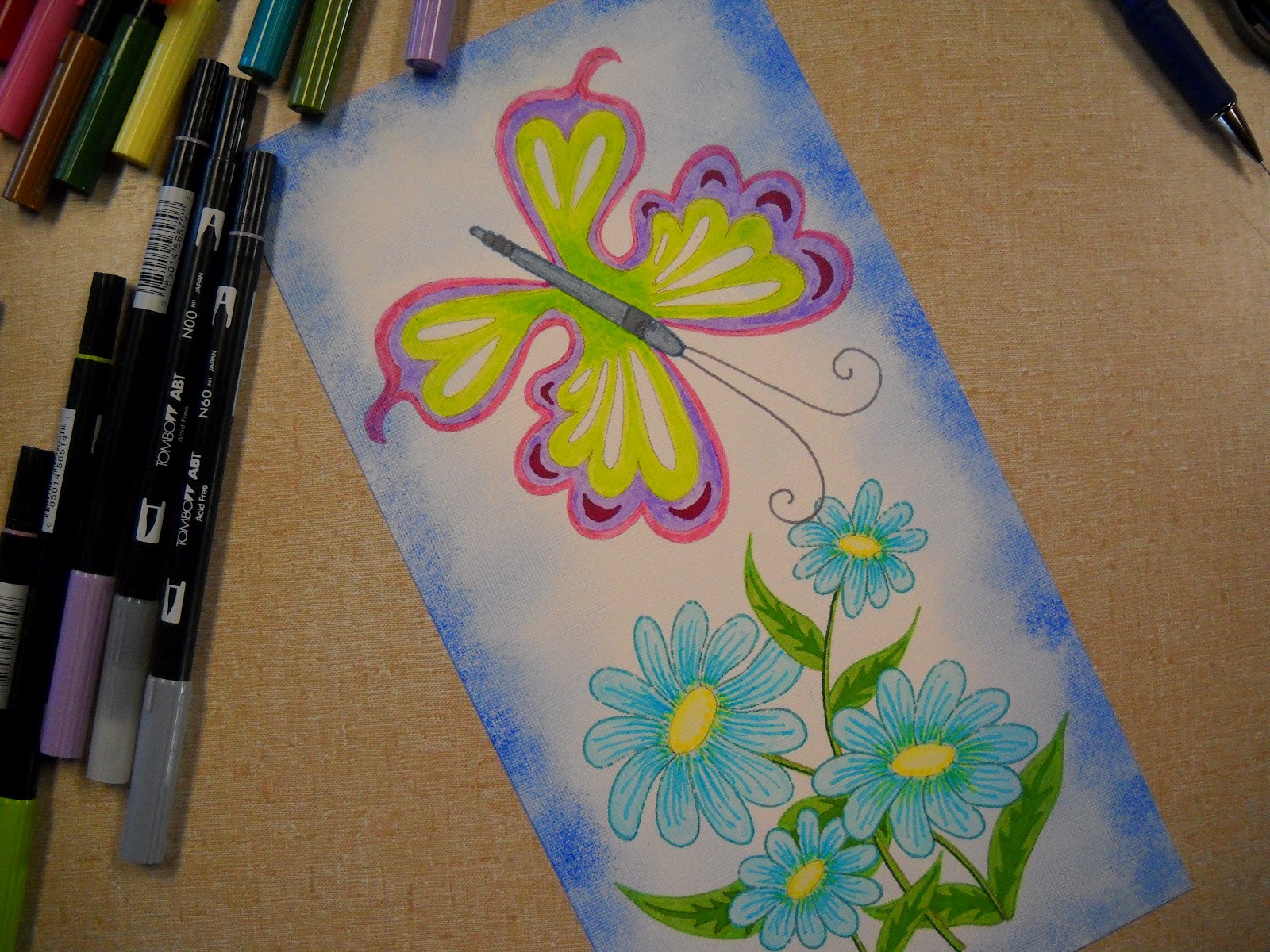
I drew in
some flowers and decided to add a pretty butterfly.

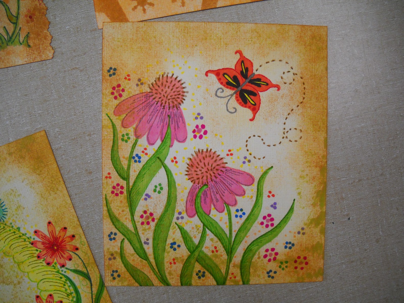
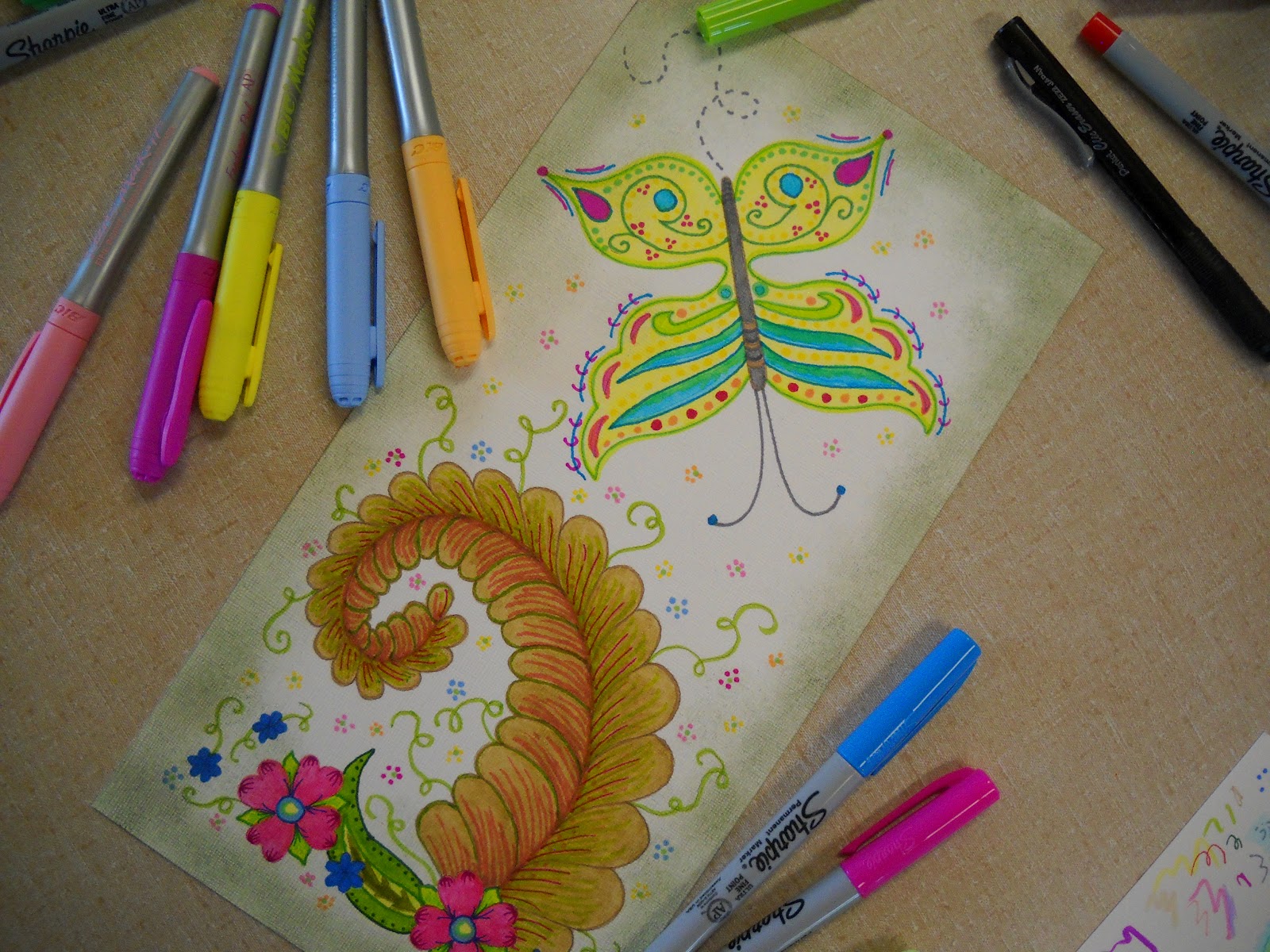
Here
I added more color and little flowers in the background. I like to add tiny
dashed lines to create movement from the butterfly.

The
height of the photo I used on this page really helped in allowing more of the
art work to show through.
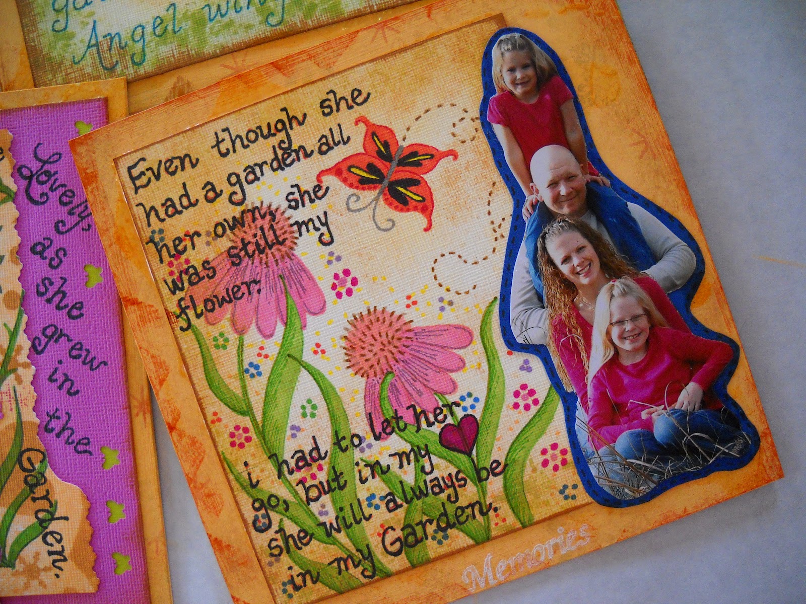
Well
the art work did show through, until I wrote all over it. It is so much fun to
do a project like this.
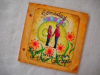

When
I saw this photo I knew it would work so well for the final page of my book.

For
this ending page I went back to my favorite feathered design.

Just
recently I was sitting down with my oldest granddaughter and I was helping her
draw a flower to color. I said now put a caterpillar on the flower. She had no
clue how to do that. When I showed her
how easy it was to do this, you could just see the surprise in her eyes as she
said “cool”.

Using
this photo for the final page seemed to be the appropriate ending for my story.

I
cut them out of a photo my daughter had given me. I like the way they appear to
be walking through a garden.
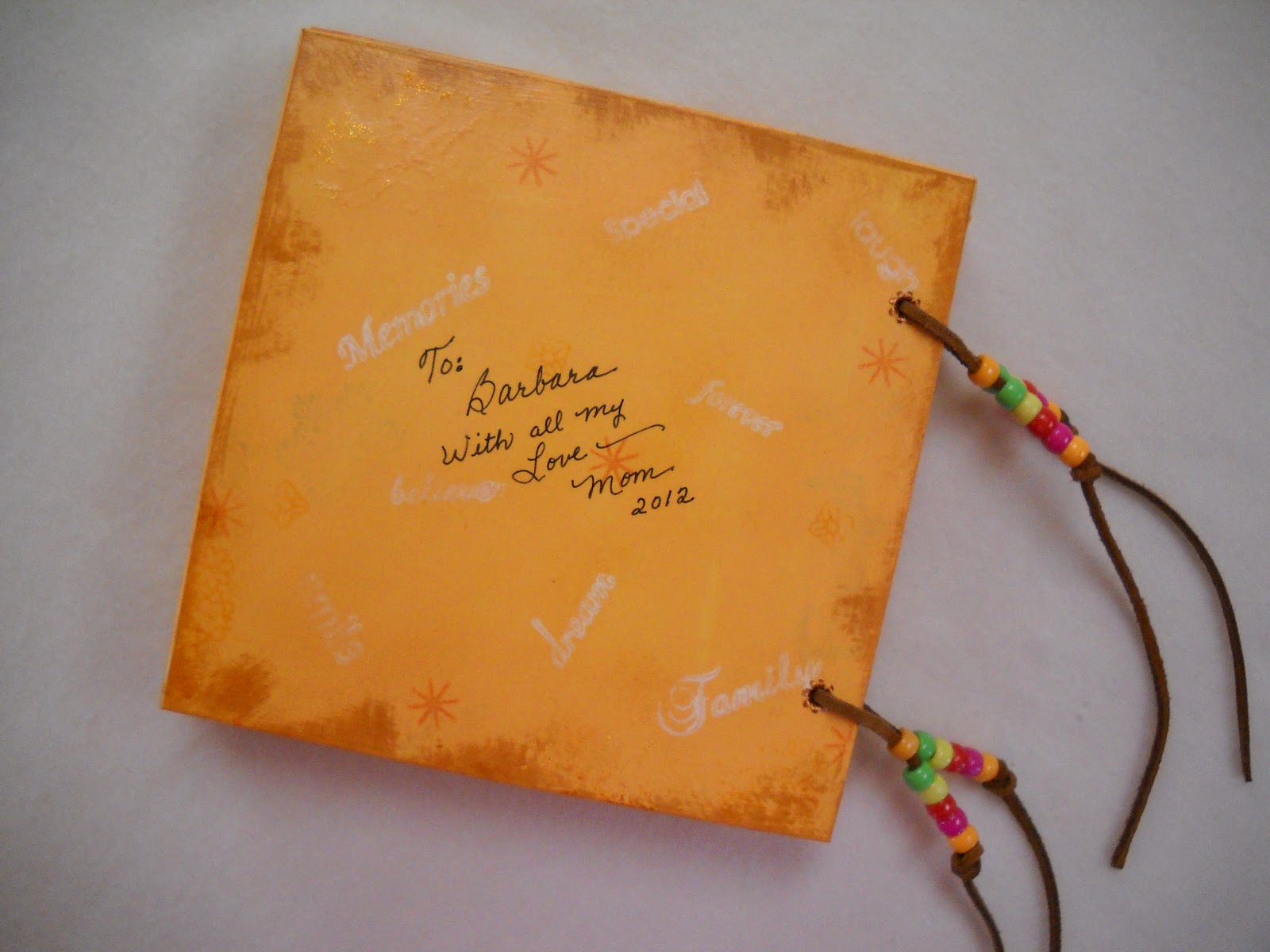
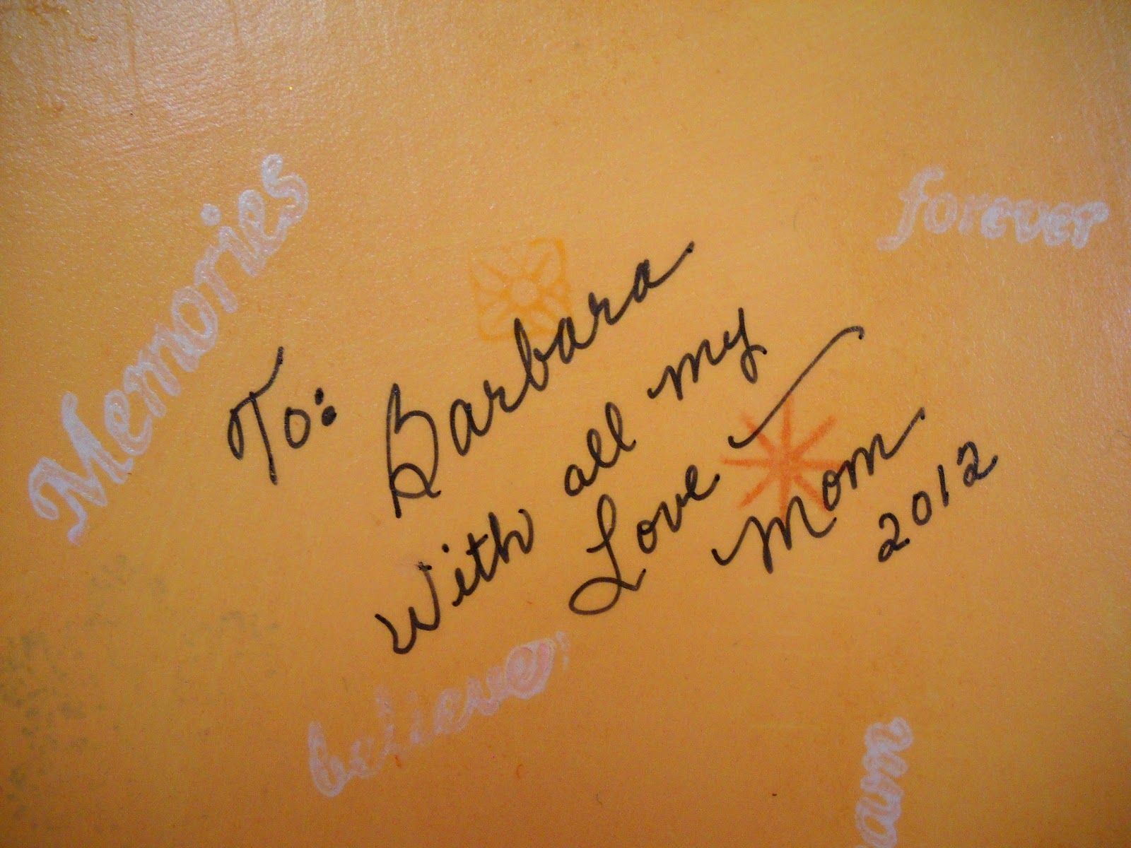
I
inscribed the book to my daughter and it will be hers someday.

Since
this is a keepsake I stamped inspirational words on the on the base of the
pages after I applied the acrylic paint.

Here
I used my stamp pad and inked the edges front and back of each page.

It
is time for the placement of the holes and to add the eyelets.